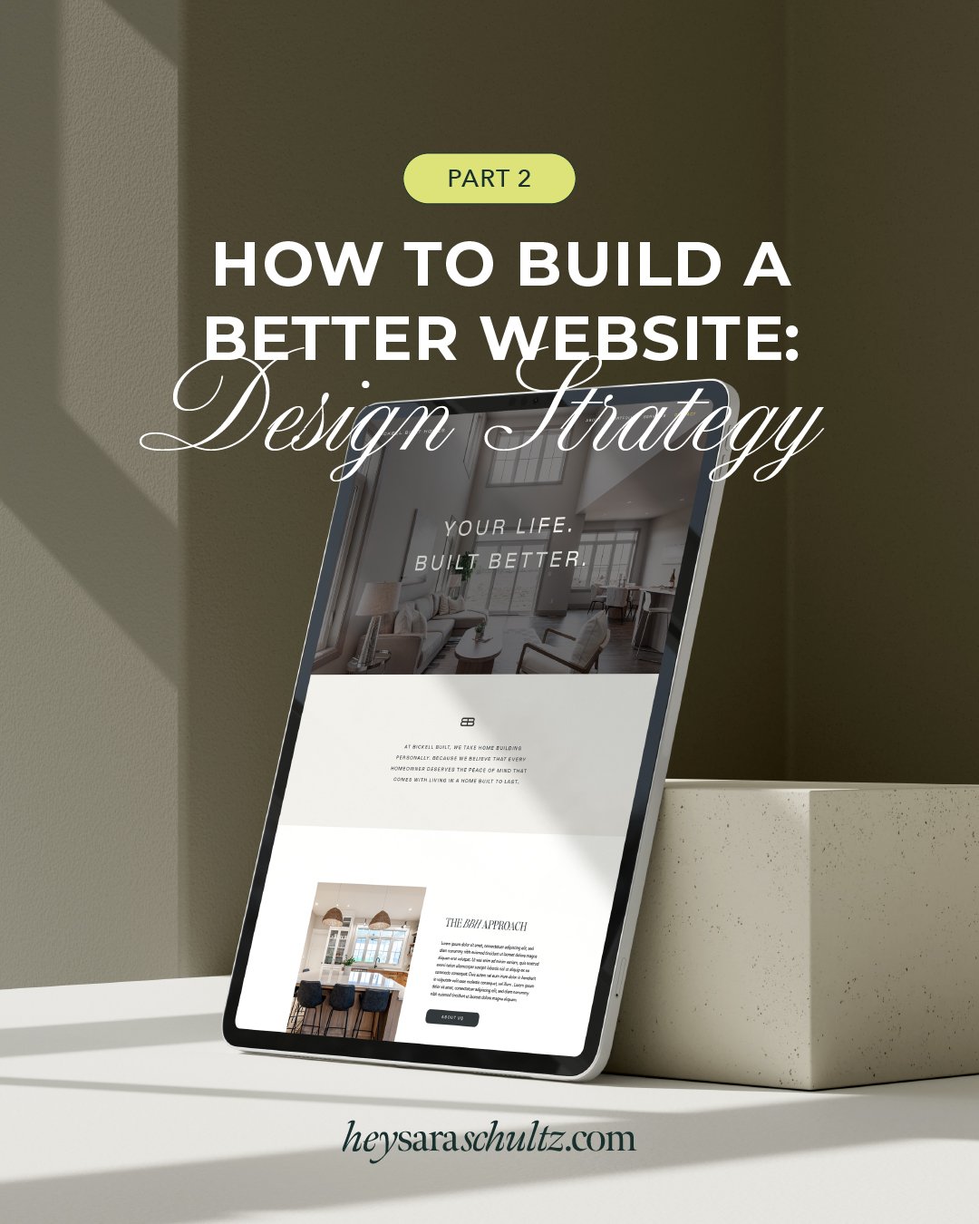
How to Build a Better Website Part 1: The Foundational Elements
Are you building a website for the first time, or do you simply want to make the one you've got work harder for you?
I hear you and I'm with you! As a fellow small-business owner, I know exactly how important a website is when it comes to attracting dreamy clients and turning interested parties into brand-obsessed loyalists.
That little piece of alchemy is exactly what I specialize in as a branding expert, and it's also the information I want to share with you so all your goals can come true. In fact, the number one thing I hear from people when they start talking about building their brand is that they need to create a website. And that's the logical first step, right? WRONG.
Before you can even think about executing a website, you'll need strong branding and foundational assets to build things with.
Building a website without first developing your brand identity would be like asking someone to make you soup without telling them what kind of flavor profile you want, which ingredients to feature, or your dietary preferences. Without that direction, you might end up with a spicy fish soup when you really want a comforting chicken noodle. Those are two very different end results!
Maybe I'm stuck on the soup metaphor because I'm feeling a little under the weather, but here's the point: Your website is the final product and your branding elements are the foundational ingredients. You can't start to tell your story in a meaningful way without having those those components in order first.
Now that we've established this critical precursor, here are a few things you should absolutely keep in mind when building the amazing bit of digital collateral that is your website. These tips are an excellent place to start to help you drive brand voice and visuals, and fully drive the experience.
Four tips for building a better website:
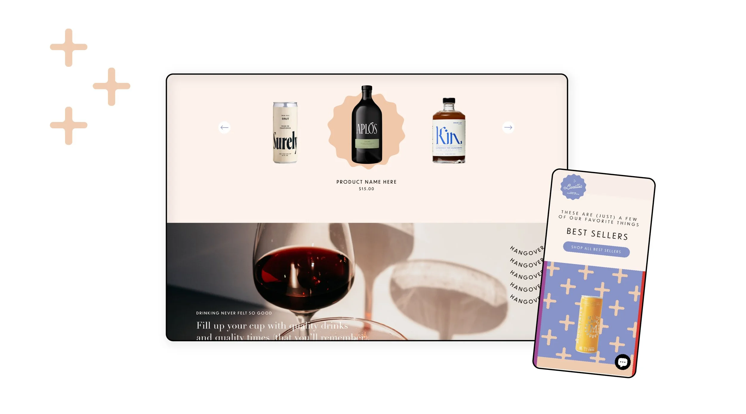
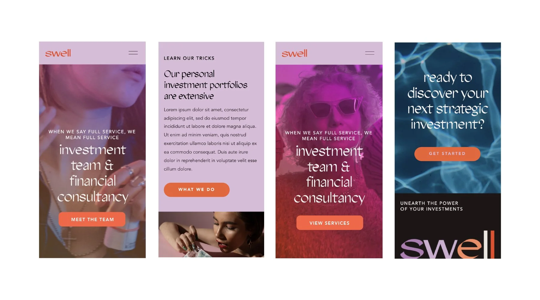
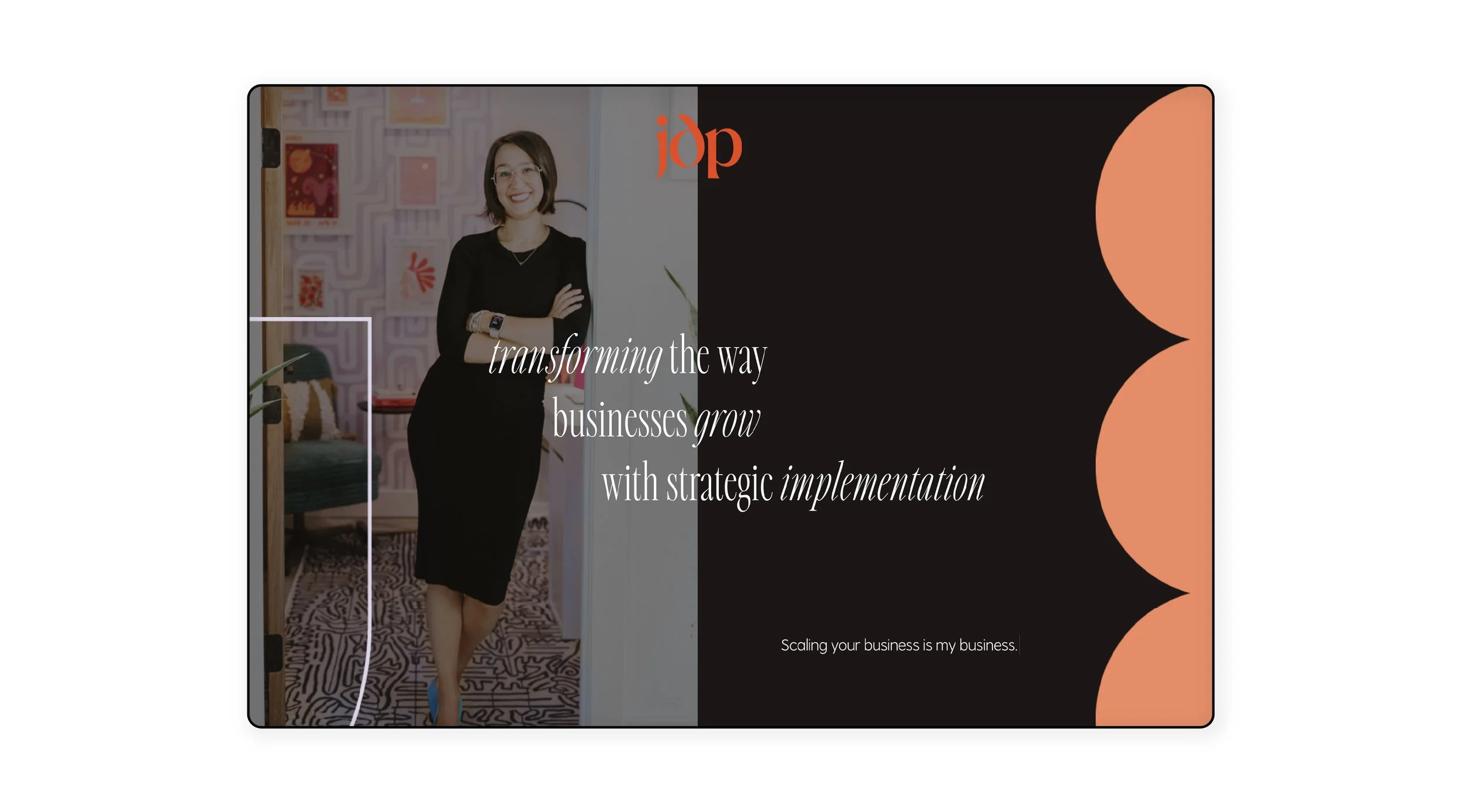
1. Use your brand assets EVERYWHERE
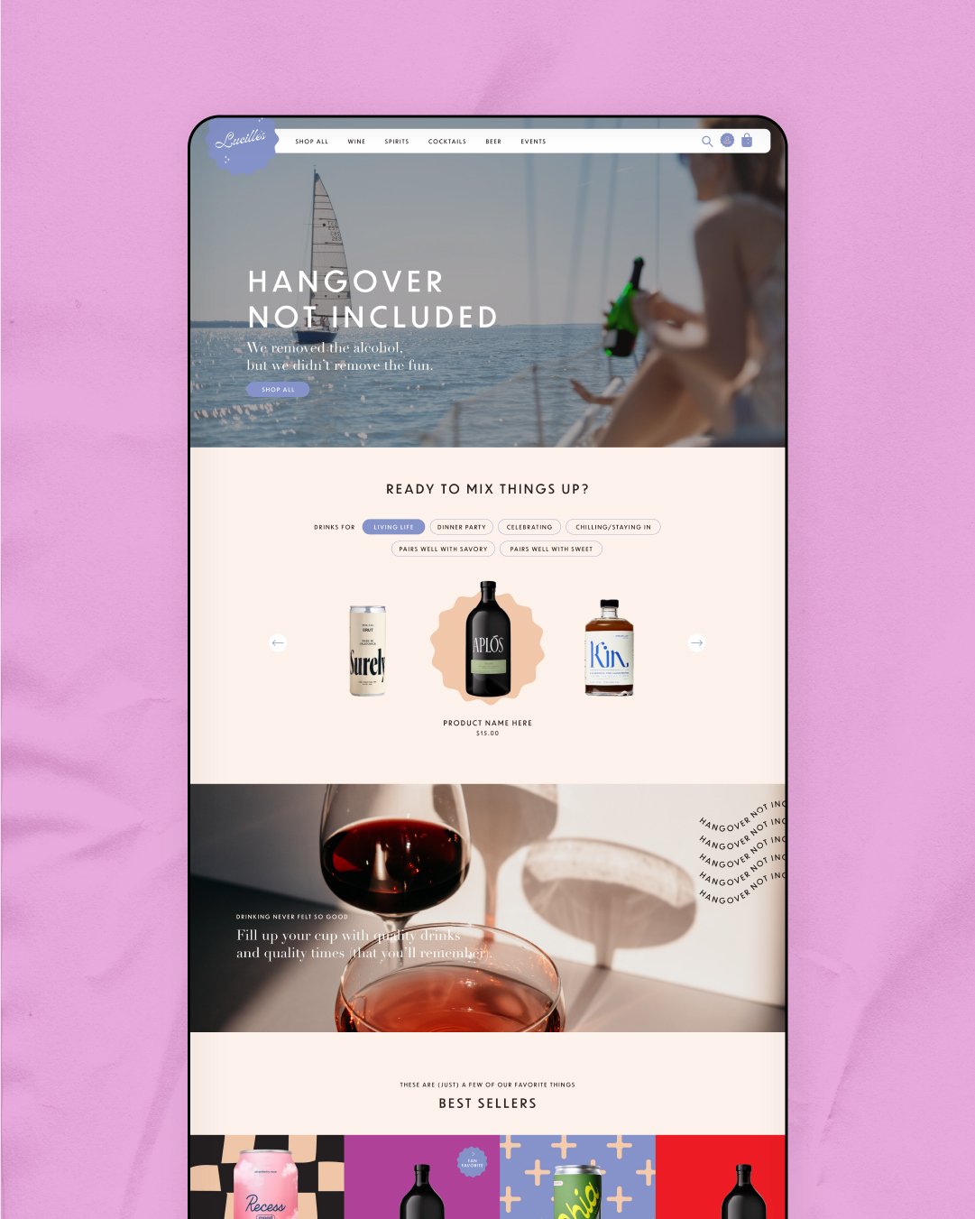
Your site should be dripping in your personality, whether that personality is a bold, bright, maximalist, or a cool, calm, minimalist. Whatever your brand identity is, your visitor should be able to pick up on that feeling right away.
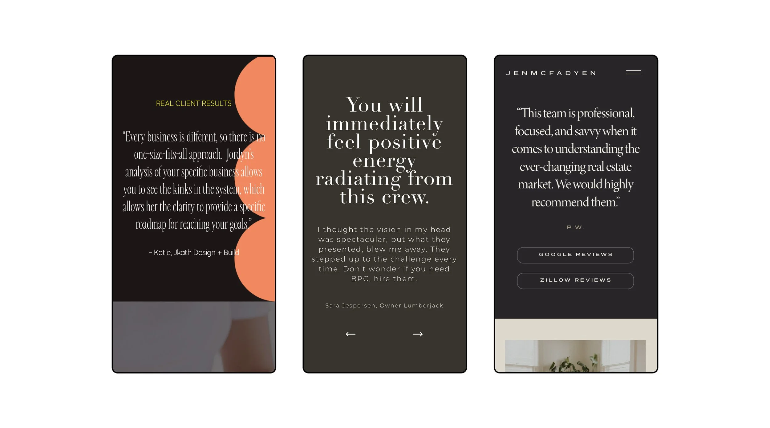
2. Add testimonials throughout your website
People love to know you're trusted and beloved by the people who have worked with you. Sprinkle testimonials throughout your site so that your visitors are always reminded that you're credible.
3. Have really clear CTAs
Make it clear what you're asking of people (e.g., "learn more about my services" vs "get in touch"), and make it easy for people to take action. Don't bury your CTAs too far down the page, or only offer one or two opportunities to take action. Really think about what you want them to do and make sure your messaging supports that. Which brings my to my next point...
4. Say more with less.
When it comes to messaging and copy, resist the urge to launch into all the reasons why someone should hire you, or detail your full background. There's a time and a place for everything. Figure out your messaging hierarchy and key communication touch points, then give visitors juuuuuust enough information to want to engage in next step with you.
You don't need to go overboard on your entire process or outline exactly how you do what you do (that information can be shared on a call!) -- just communicate the right balance of information to intrigue folks to take action.
So, what’s next?
During Part 2 of this series, I'll go more in depth about the strategies to use to build a better website. In the meantime, make sure you've got your foundational branding elements in order (those are the soup ingredients!). If you're feeling overwhelmed with that part, my agency Free Afternoon might be able to help. You can learn more about how we help growing brands here.

