How to Create a Balanced Instagram Grid and Drive Brand Recognition
So you want to win more dreamy clients and convert people from followers into brand-obsessed loyalists?
What business owner doesn't want that?! In the big wide world of branding, there are a lot of elements that factor into this equation, but today we're going to hone in on one particular aspect: building a more balanced Instagram grid that will win you brand recognition. This best practice doesn't require a huge marketing budget or expert design skills, but it does ask you to lean into one really important principle, which is what I'm covering today. Shall we begin?
Create a Better Instagram Grid by Leveraging Balance
In the world of design, we talk about the principle of balance, which refers to the way different elements are weighed against each other throughout the design to create cohesion and visual satisfaction. Truthfully, it's important to consider in every design touchpoint, but today we're tackling Instagram so let's stay focused.
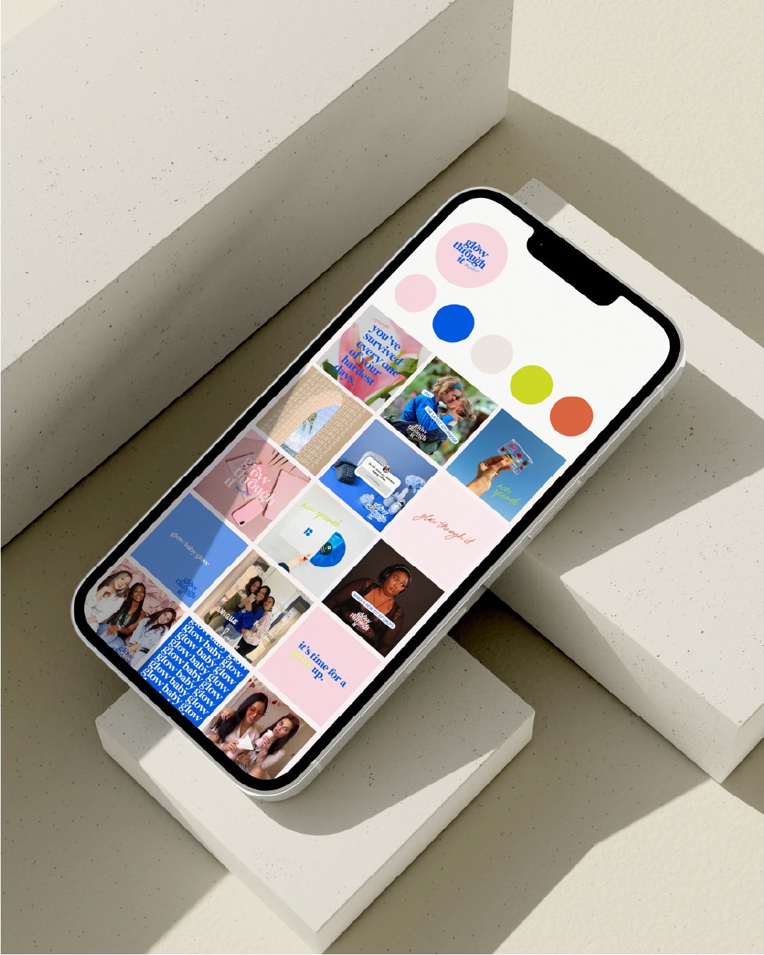
You know those profiles you land on that are just SO satisfying and pretty to look at because everything feels complementary, copasetic, and BALANCED? That's what we're talking about here. It might suddenly seem obvious, but the truth is that this cardinal rule is usually the first to go when we small-business owners are wearing a lot of hats and feel like posting something is better than posting nothing at all (even at the expense of our brand vibe).
Today's design crash-course will give you insight into HOW to achieve a balanced grid so that: 1) your grid looks damn good and, 2) the way you plan content feels easier and more accessible.
How do I use balance to create a better grid?
The easiest way to achieve balance on your Instagram grid is to use pattern to create a rhythm. For example, you could share posts that alternate between:
Graphics and photos
Black & white photos and color photos
Close-up shots and wide shots
Flat lays and selfies
Dark photos/graphics and light photos/graphics
Why does this work? Because patterns creates variability and, when done well, that naturally creates balance (which we know humans inherently gravitate toward).
You can try an every-other-post approach or something different — the idea here is to find a pattern and stick with it.
Balance can also help make content creation easier than ever.
Here's the other great part about this approach to planning your grid: It ensures you have variety in your content. Because it's not just about the feed experience, it's also about the value you're serving up to your audience via different content types. And this, my friends, is the key to establishing some efficiencies in your planning process.
Instead of planning next month's content by individual post, start by thinking about how you want to achieve balance in your grid, then back into the specific types of content you'll need from there.
I know planning content can sometimes feel like a drag, or overwhelming, or un-fun. Believe me, as a fellow small-business owner, I totally understand that this might not be a hat you want to wear. But these tips will make your life so much easier when it comes to execution.
Remember, balance is literal and figurative.
Real talk: The most important balance to maintain is the one we have with our apps. Social media can chew you up and and spit you out if you don't establish some healthy boundaries with it. It is not — I REPEAT — it is not your job is not to control the algorithm. We all know it's changing all the time.
So, focus on the things you can control, like staying true to your branding and building a better grid. And know that it's okay to take a break, invest your time elsewhere, and remind yourself it’s only one of the tools in your tool belt
Building a better grid doesn't stop here.
Balance and pattern are massive tools at your disposal, so absolutely use those! I also encourage you to audit your current grid and see what's working and what's not. And if you're ready for more actionable support to build your grid and your business, you're probably ready for my course, The Good Feed.
Everything is pre-recorded so you can go at your own pace. Plus, it comes with visuals and worksheets that will help you plan your own content and activate it. You'll even learn how to gear everything you learn toward other platforms, like print collateral, Pinterest, and more. It's truly a great way to make your communication channels work harder for you by harnessing the power of branding. Oh, and did I mention it's on super sale right now? Because it suuuuure is!


