
How to Upload Custom Fonts in Squarespace (Finally! No Code. No Tears.)
If you’ve ever fallen in love with a font that isn’t in Squarespace’s default library (lol, same), today is your day: Squarespace now lets you upload your own custom fonts — no CSS wizardry required.
Yes, friend. We are dragging. We are dropping. We are thriving.

The Different Types of Color Codes (And Why They Matter for Your Brand)
If you've ever sat down to design your brand visuals—or hand over brand guidelines to a designer—you’ve probably run into a bunch of confusing color terms: HEX codes, RGB, CMYK, PMS... what do they all mean?
And more importantly—when should you use which one?
Today, let's break it down without the jargon overload. Here’s your quick-start guide to color codes and how they fit into building a brand that actually looks cohesive everywhere you show up.

Where to Use Your New Branding
You're rebrand is complate…but what’s next when you finish?
Here is a list of all the places your branding should be updated to be consistent across every touchpoint after your finish your rebrand.
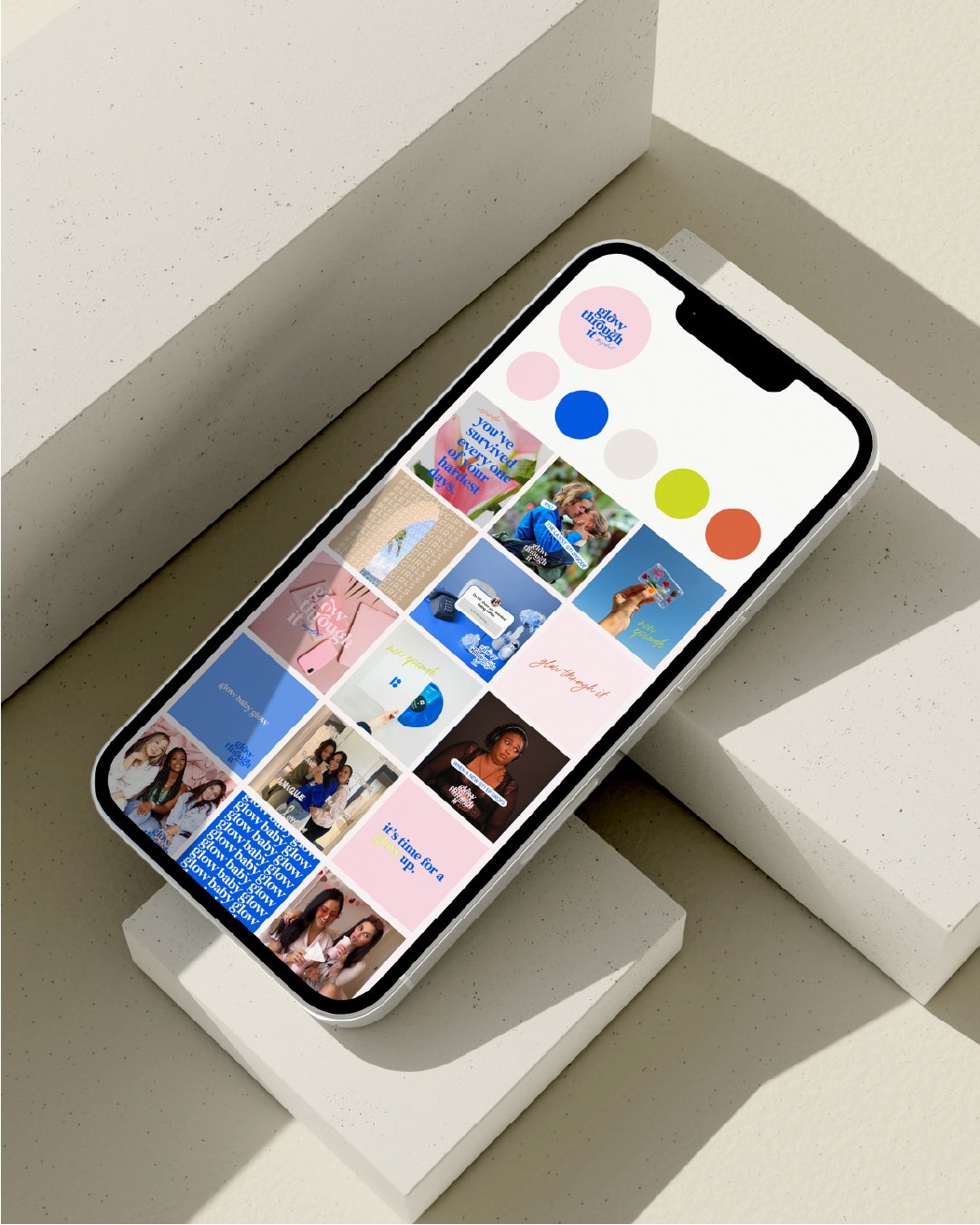
How to Create a Balanced Instagram Grid and Drive Brand Recognition
So you want to win more dreamy clients and convert people from followers into brand-obsessed loyalists? One way to do this is by building a more balanced Instagram grid. This best practice doesn't require a huge marketing budget or expert design skills, but it does ask you to lean into one really important principle: Balance. More on that here.
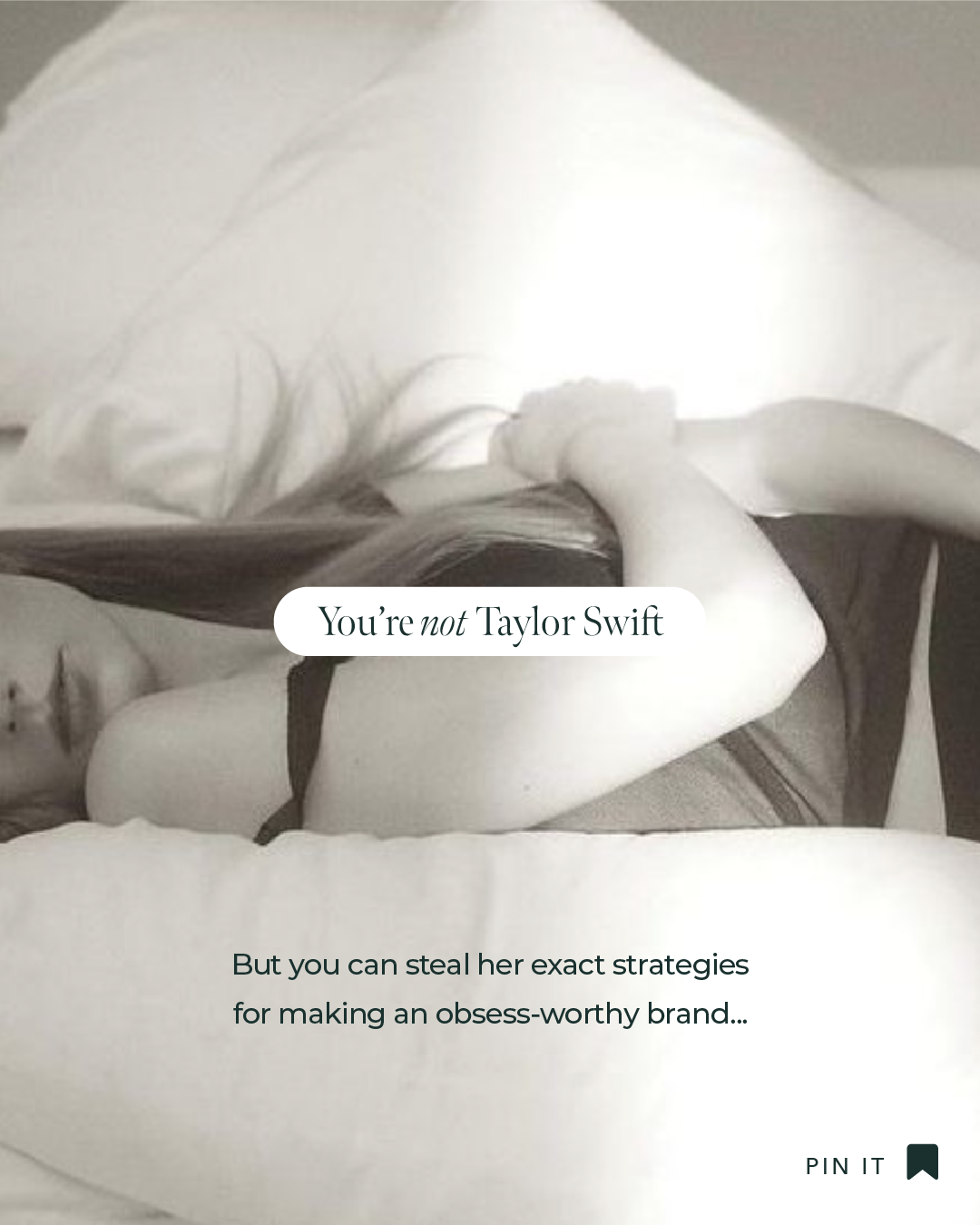
3 T-Swift Approved Brand Strategies you can use starting TODAY
Taylor Swift knows how to build an empire. Let’s dive into some of the lessons we small business owners and self-starters can learn from the most love to hate and hate to love artist of our time: Taylor Swift. In other words, I'm going to tell you exactly which takeaways you'll want to bring back to your own branding/marketing efforts to hit it out of the park, just like T-Swift does.

3 Branding Lessons We Can Learn From Super Bowl Ads
Super Bowl ads are a goldmine for anybody who wants to add some best practices into their own branding playbook. Let’s dive into some of the lessons we small business owners and self-starters can learn from the most iconic Super Bowl ads of years past. In other words, I'm going to tell you exactly which takeaways you'll want to bring back to your own branding/marketing efforts to hit it out of the park

2025 Instagram Sizing Guide
7th Times the Charm: How To Use The Rule Of Seven
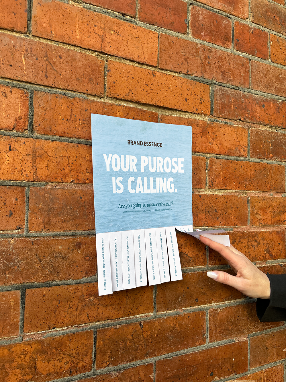
How to Choose Fonts That Reflect Your Brand Personality

Using the 12 Brand Archetypes to Catapult Your Brand

3 Logo Variations Every Brand Needs

Sage: Fonts

Can Good Branding Make You More Money?
If you’re thinking of investing in branding design, then you’re probably wondering: what is the impact of branding on a business? Click to explore branding return on investment.
How to Create an Obsess Worthy Email Signature in Gmail
Email signatures are a great way to incorporate your branding into your client communication. In this blog, we will walk through how to create a branded email signature.

How to Use Negative Space in Your Designs
Negative space is frequently misunderstood by non-designers; while some may see it as wasted space, it’s not. Your design needs room to breathe!

Why you need a Style Guide for your brand
No surprise here....I am passionate about good branding and I firmly believe it will elevate your business. The right font pairings, colors, logos and marks (swoon) together tell the world what your brand stands for & what it’s all about.

Branding Case Study: Little Words Project
Little Words Project® encourages women to both be kind to themselves and to others. Curating fun, carefree, feminine vibes while elevating above an overly-youthful feel, we used minimalistic design elements, a clean, sans-serif font, and soft color palette for this extra loving, kind brand.
